Understanding Design Systems: A Comprehensive Guide
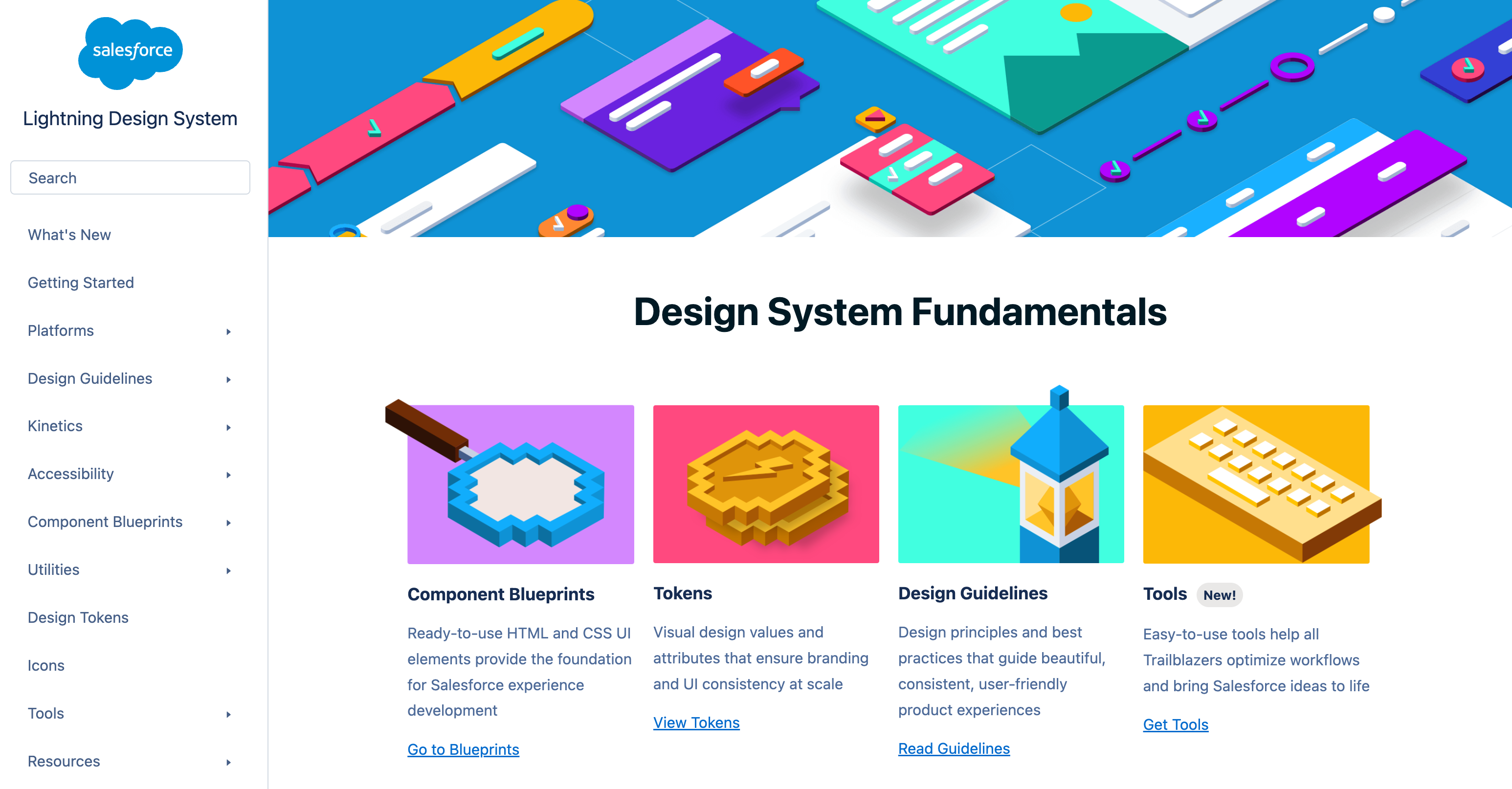
Image courtesy of Webflow
🎨 Understanding Design Systems: A Comprehensive Guide
What is a Design System? 🤔
A design system is a complete set of standards, reusable components, and documentation that acts as the “single source of truth” for building digital products. It ensures that everyone—designers, developers, and product managers—works from the same foundation to create a consistent and cohesive user experience across all platforms.
Think of it as the DNA of your digital product. Just as DNA provides the blueprint for a living organism, a design system provides the blueprint for your entire product ecosystem.
Why Do Design Systems Matter? 💡
Before we dive into the components, let’s explore why design systems are absolutely essential for modern product teams.
🚀 Consistency at Scale: As your product grows, maintaining visual and functional consistency becomes a huge challenge. A design system ensures that a button looks and behaves the same everywhere—whether it’s in your web app, mobile app, or marketing site.
⚡ Efficiency & Speed: Stop reinventing the wheel! Teams can pull from a library of pre-built, tested components, dramatically speeding up both design and development cycles.
✅ Higher Quality: When components are centralized, bug fixes and accessibility improvements benefit the entire product at once. Best practices are baked right in.
🗣️ Better Communication: Design systems create a shared language between designers and developers, reducing miscommunication and smoothing out the handoff process.
🧱 The Core Components of a Design System
A robust design system isn’t just a random collection of assets. It’s a thoughtful, layered architecture where each level builds upon the last.
1. Design Tokens: The Atomic Foundation ⚛️
Design tokens are the smallest, indivisible pieces of your system. They’re platform-agnostic name-value pairs that store your design decisions.
Examples:
🎨 Color Tokens
1
2
3
color-primary: #2563eb
color-primary-hover: #1d4ed8
color-text-primary: #1f2937
1
2
3
color-primary: #2563eb
color-primary-hover: #1d4ed8
color-text-primary: #1f2937
📏 Spacing Tokens
1
2
3
space-xs: 4px
space-sm: 8px
space-md: 16px
1
2
3
space-xs: 4px
space-sm: 8px
space-md: 16px
🔤 Typography Tokens
1
2
3
font-family-base: "Inter, system-ui, sans-serif"
font-size-body: 16px
font-weight-semibold: 600
1
2
3
font-family-base: "Inter, system-ui, sans-serif"
font-size-body: 16px
font-weight-semibold: 600
Other common tokens include:
- Border Radius
- Shadow
- Opacity
- Z-Index
- Animation
The real beauty of tokens? Their power of abstraction. Need to update your primary brand color across 50 components? Just change one token value instead of hunting through hundreds of files!
2. Component Library: The Building Blocks 🧩
Components are the reusable UI elements built from your design tokens. Each one should be self-contained, well-documented, and available in both design tools (like Figma) and code.
Example: Button Component
- Sizes: Small, Medium, Large
- States: Default, Hover, Active, Disabled, Loading
- Variants: Primary (high emphasis), Secondary (medium), Tertiary (low)
Example: Input Field Component
- States: Default, Focused, Error, Disabled, Success
- Features: Label, placeholder, helper text, character counter
Example: Card Component
- Anatomy: Header, Media, Content, Footer
- Variants: Default, Elevated, Outlined, Interactive
3. Pattern Library: Solved User Flows 🗺️
Patterns are repeatable solutions to common design problems. They show you how to combine multiple components into meaningful interfaces.
- 🔐 Authentication Flow: Login forms, password recovery, 2FA screens.
- 📊 Data Table: Sorting, pagination, search, bulk actions.
- 🧭 Navigation: Top nav, sidebar, mobile menu, breadcrumbs.
- 📝 Forms: Multi-step progression, validation, error handling.
4. Style Guide: The Visual Identity 🎯
The style guide documents your brand’s visual language to ensure pixel-perfect consistency.
- 🖼️ Logo Usage: Different variations, clear space, what not to do.
- 🌈 Color Palette: Primary, secondary, and semantic colors with accessibility ratios.
- ✍️ Typography: Typefaces, font weights, heading hierarchy.
- 📐 Iconography: Style, sizes, and naming conventions.
- 🌄 Photography: Image style, composition, and aspect ratios.
✨ Design Principles: The Guiding Philosophy
Design principles are the high-level beliefs that guide every decision. They should be specific and actionable.
“Clarity Over Cleverness” 🧠 Prioritize understanding over aesthetics. Use plain language and make actions obvious. Example: A clearly labeled “Save Changes” button is better than a cryptic icon.
“Progressive Disclosure” 🪜 Show users only what they need, when they need it. Hide complexity until it’s required. Example: Collapse “Advanced Settings” by default.
“Performance is a Feature” ⚡ Fast loading is non-negotiable. Optimize everything. Example: Components should render in under 100ms.
Design Language vs. Design System: What’s the Difference? 🤷
This is a key distinction!
- Design Language is the “soul” or “grammar.” It defines what the product should look and feel like—its personality, colors, and typography.
- Design System is the complete “body” and “toolbox.” It makes the design language tangible with reusable components, code, and concrete guidelines for how to build it.
In short: The design language provides the vision, and the design system provides the tools to execute it consistently.