Design Language and design System at SnapCore
🌐 Design Language & Design System at SnapCore
Design isn’t just about how things look — it’s about how they feel and how consistently they work across every product. At SnapCore, our design language and design system are the backbone of that experience, ensuring accuracy, trust, and playfulness in every interaction.
🧩 Design Language vs. Design System vs. Component
• Design Language: The philosophy, style, and vocabulary — colors, typography, tone — that define SnapCore’s identity. It’s the voice of our brand. • Design System: The coded toolkit that implements this language. It includes reusable components, rules, and guidelines, acting as the single source of truth for consistency across platforms. • Component Library: The practical collection of UI elements (buttons, forms, icons). Think of them as the bricks that follow the blueprint of the system.
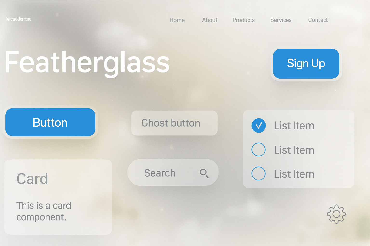
✨ SnapCore’s Design Language
• Signature Effect: FeatherGlass — semi‑transparent cards with soft shadows, subtle vivid colors, and adaptive blur. • Philosophy: Accuracy + Trust + Life + Modularity + Playfulness. Interfaces should feel trustworthy, lightweight, layered, and customizable. • Toolkit: CSS variables for flexibility and scalability. • Adaptive: Responds to Windows/Mac system themes while maintaining the “floating card” aesthetic.
🎨 Color Psychology
SnapCore’s palette is carefully chosen to balance trust, energy, and clarity: • Trust & Accuracy → Blue (#2e89db) for stability and reliability. • Life & Growth → Muted green (#239c4f) for freshness and subtle vitality. • Energy & Playfulness → Mustard yellow (#edb928) and coral (#ff6f61) for optimism and warmth. • Neutral Support → Clean white/light gray (#FFFFFF / #F1F1F2) for clarity and simplicity. Together, these colors create a canvas that feels modern, crisp, and emotionally resonant. Our Color Palette: 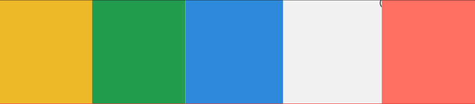
🧠 SnapCore Design Tokens (FeatherGlass)
• Primary Base: Warm Coral (#FF6F61) or Charcoal (#2C2C2C for dark theme) → emotional tone and background warmth. • Primary Accent: SnapCore Blue (#007BFF) → buttons, CTAs, highlights. • Secondary Colors: Soft Gray (#E0E0E0 / #CCCCCC) + Deep Charcoal (#1A1A1A) → structure and balance. • Utility / Neutral: Frosted White (rgba(255,255,255,0.6)) → overlays and text clarity.
Color Ratio Guideline (70-20-10)
• 70% Primary Base • 20% Secondary • 10% Accent This ensures harmony while keeping SnapCore Blue as the trust anchor.
🧱 Component Library
The Component Overview is the beating heart of the system. It provides: • Clear purpose and functionality for each component. • Visual + interactive examples to show usage across contexts. • Guidelines that promote consistency and efficiency. By centralizing this knowledge, teams can collaborate seamlessly and build interfaces that feel cohesive and user‑centric.
🎭 Theming
Theming is where SnapCore’s adaptability shines. It allows customization while staying true to the design system’s standards. SnapCore currently offers two theming options:
- Light → airy, crisp, and clarity‑driven.
- Dark → deep, balanced, and immersive. This flexibility ensures brand alignment across products while enhancing user experience.
🚀 Closing Thought
SnapCore’s design language and system aren’t just about aesthetics — they’re about building trust, clarity, and joy into every interaction. With FeatherGlass as our signature and modular theming as our foundation, we’re crafting a design identity that feels alive, adaptable, and unmistakably SnapCore.